.png)

August 2025 Edition: -Choosing the Right Paper for your Fountain Pen, -20% off KWZ Maroon Ink (with bonus review), -15% off ALL Bortoletti products!
- Jul 31, 2025
- 6 min read
Choosing the Right Paper for Your Fountain Pen
Writing with a fountain pen is a tactile, intentional experience—one that rewards those who get the materials right. While nibs and inks often steal the spotlight, the paper you use plays a crucial role in how your writing looks and feels. The right sheet elevates every stroke; the wrong one turns pleasure into frustration. Here's how to choose the best option for your needs.
1. Choose Fountain Pen-Friendly Paper
Fountain pens lay down more ink than ballpoints or gel pens. Unfortunately, standard office paper often can’t keep up—leading to feathering, bleed-through, and a lackluster visual result.
Look for paper labeled:
“Fountain Pen Friendly”
“Ink-Resistant”
“High-Performance Writing Paper”
Recommended brands include:
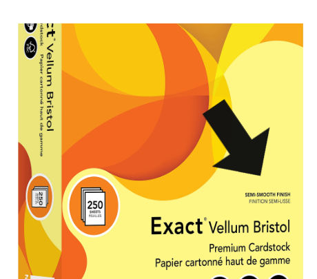
Rhodia
Clairefontaine
Tomoe River
These papers are smoother and less porous, helping ink stay atop the page longer. That resistance reduces feathering, enhances shading, and preserves crisp lines—especially with slow-drying inks.
2. Check the Paper Weight
Paper weight, measured in grams per square meter (gsm), affects how well a sheet resists ink bleed-through.
90gsm or higher is the sweet spot for most fountain pens.
Lightweight options like Tomoe River (52–68gsm) defy expectations with impressive ink compatibility despite their thinner feel.
On a budget? Try Xerox Bold Digital Printing Paper—widely available and remarkably fountain pen-friendly.

Heavier paper preserves ink clarity and keeps both sides usable. Lighter stock may feel faster or smoother but isn’t always clean when flipped.
3. Consider Paper Texture
Texture influences how the nib moves across the page and how the ink interacts with the surface.
Smooth paper provides a frictionless writing experience, ideal for most fountain pens.
Textured paper adds visual and tactile charm, though it may require ink and nib pairing finesse.
For a balance of beauty and performance, try G. Lalo Verge de France—a laid paper with subtle texture that still plays nicely with many pens.
4. Try Before You Buy
Even top-rated paper can clash with your specific pen and ink setup. Sampling avoids frustration and gives you confidence in your choice.
Options include:
Pen shows and stationery expos, where vendors offer sample pads or on-site testing
Single pads or notebooks, which let you trial a format before committing to bulk purchases.

October 17, 18 & 19, 2025 We will be hosting a class on October 18, 2025 for beginner fountain pen users. If you want to know more about fountain pens and love in person instruction and demonstration, definitely check out the Colorado Pens Show!
5. Understand Coatings and Finishes
Coatings can alter how ink behaves, especially for sheening or shading inks.
Coated paper resists moisture and feathering but tends to dry slowly, making smudging a real concern.
Uncoated paper absorbs ink quickly, which may mute sheen or obscure fine details
Pay attention to terms like “matte,” “gloss,” “coated,” or “uncoated” in product descriptions—they often hint at performance quirks.
6. Binding and Page Format
The way paper is bound affects usability, especially for journaling or ink reviews.
Choose based on use case:
Stitched bindings lie flat—ideal for writing-intensive journaling
Perforated sheets offer convenience for correspondence or note sharing
Printed guides (dots, lines, grids) support precision in ink tests or clean handwriting
Final Thoughts
Paper may seem like a backdrop to the fountain pen experience, but it’s integral to how ink behaves and how writing feels. Choosing wisely—by understanding weight, texture, coating, and format—turns everyday writing into a craft. Experiment a little, trust your tools, and enjoy the refinement that comes from pairing pen and paper with care.
Ink Review: "Maroon" by KWZ
A rich, dark maroon ink with subtle warmth and understated elegance.
🖋 Core Properties
Features: (This is just a description of the ink properties)
⬜ Sheen
⬜ Glitter/Shimmer
⬜ Scented
⬜ Unique Properties
✅ Standard Fountain Pen Ink
⬜ Waterproof/Permanent Ink
The Review:
This ink has a deep, elegant color and writes incredibly smoothly—it almost feels like it’s lubricating the nib, helping the pen glide. We tested it with both a fine and a broader nib, and it flowed perfectly every time, with no skipping or clogging. Even on basic copy paper, it held up well, and in some areas, you can see subtle shading that gives the writing some character. After two weeks of use in three different pens, it stayed consistent and reliable throughout.
To bring the review to life, I’ve included a series of photographs that demonstrate the ink’s behavior under real writing conditions. These images highlight everything from smudge resistance and drying time intervals to the flow characteristics observed during extended writing. You are seeing my authentic comments penned using the ink itself, offering a direct glimpse into its consistency, saturation, and personality of the ink. These snapshots serve not just as proof, but as part of the ink’s narrative—capturing its strengths, quirks, and overall impression.


**Please note that our reviews may differ significantly from what you typically see from other individuals or companies. This is more than just a review—it's an ink test conducted for both our benefit and yours. We use each ink for one and a half to two weeks to gather as much information as possible. During this time, we test a range of nib sizes to evaluate how the ink performs across different writing styles. Some inks are tested with everything from a fine nib to a 1.1 mm stub, while shimmer inks may only be used with broad and stub nibs, as we generally advise against using shimmer inks with fine or extra-fine nibs.
This isn’t a “sit down, open a bottle, and write a review in 15 minutes” kind of approach. Instead, we aim to offer insights based on real-world tests and extended daily use. Keep in mind, every pen writes a little differently, and ink performance can vary from one to another. We also conduct several tests on various types of paper. Most of the time, we use Clairefontaine Triomphe 90g paper as our high-quality benchmark, and Pen+Gear 20lb copy paper as a lower-quality comparison.**
Performance Factors
Saturation & Depth - (How rich and bold the ink appears)
4 Nibs (✒️✒️✒️✒️✧) – Deep, rich tones! Pops off the page beautifully.
Shading / Sheen / Shimmer - (How the ink performs against other inks in this category)
3 Nibs (✒️✒️✒️✧✧) – Decent shading/sheen/shimmer.
Consistency & Flow -(Is is smooth & reliable while writing?)
5 Nibs (✒️✒️✒️✒️✒️) – Effortless! Ink glides like silk—perfect consistency!
Feathering & Bleed-through - (How much the ink spread/bleed on different paper types)
4 Nibs (✒️✒️✒️✒️✧) – Excellent! No feathering on quality paper.
Drying Time - (How fast the ink dries on paper?)
3 Nibs (✒️✒️✒️✧✧) – Moderate. Dries in 13-20 seconds, decent for daily use.
Smudging & Smear Resistance - (How well the ink resists smudging)
5 Nibs (✒️✒️✒️✒️✒️) – Smudge-proof! Once dry, it won’t budge at all.
Water Resistance - (How well the ink holds up against moisture)
2 Nibs (✒️✒️✧✧✧) – Mostly dissolves. Some traces remain, but not legible.
Cleaning - (How easy it is to flush ink from a fountain pen?)
3 Nibs (✒️✒️✒️✧✧) – Manageable. Cleans out fairly easily with normal maintenance.
Staining – (Does the Ink Leave a Mark Where It Shouldn't after cleaning?)
4 Nibs (✒️✒️✒️✒️✧) - Little to no staining visible. Feed may retain faint traces, but barrel and nib clean easily.
Final Overall Rating
This is not simply an average of the individual performance factors—it's a holistic reflection of how the ink feels in hand, behaves on paper, and inspires expression. Whether sketching, journaling, or crafting letters, this rating speaks to whether the ink fulfills its promise and earns a permanent place in your collection.
This ink is a pleasure to use. Beautiful color, good flow, and just enough uniqueness to elevate your writing. Not quite perfect, but it rewards regular use and offers a refined experience without fuss.
✒️✒️✒️✒️✧
(4/5 Nibs) – The Artisan’s Pour
Interested in KWZ's Maroon ink?
15% off ALL Bortoletti Products |
For those who value elegance and tradition in their writing tools, my selection of Bortoletti products—handcrafted in Venice using Murano glass, bronze, and generations-old techniques—is now 15% off exclusively on my website. Unlike third-party platforms that take a hefty cut, buying directly supports small business craftsmanship and lets you own a piece of calligraphic artistry rooted in history. |
And a pen joke, just for fun:
Did one of your pens dissapear?
................................... It is probably just trying to make a point!
Have a great month! See you soon!
Don't forget the Colorado Pen Show is coming up in October!


Comments